The Process of Painting Necromancer
- Oct 7, 2017
- 5 min read

Sadly, my Learn To Paint kits didn't arrive before the weekend, so I had to content myself with learning to paint on my own. Looking at my previous miniatures, I think one of my major weaknesses was having very stark transitions between different colors in areas of highlighting/blending, so I wanted to focus on improving that with my next miniature. I also wanted to try doing something a little different with my skin tones, and frankly, I was in a very down mood, so I didn't want to do something very bright and cheerful, nor something very complicated. Putting all of that together, the Necromancer miniature seemed like a decent choice, so I cleaned it up and set to work.
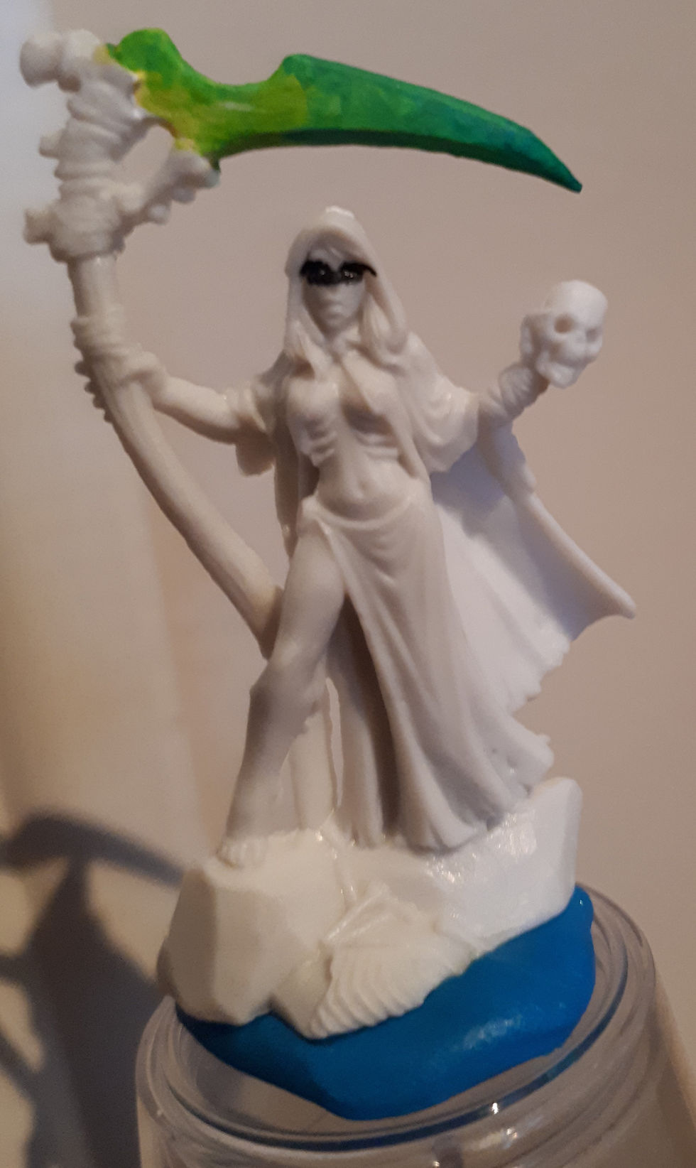
Unfortunately, the first thing that I noticed when I took it out of the packaging was that it had some really bad mold lines. I cleaned them up as much as I could with an Xacto knife, but they were still pretty noticeable. If I'd had files, I would've tried using them to clean it up further, but I didn't, so I had to live with what I could do. Hopefully, this won't be a major issue with the rest of my Bones-material miniatures, because that'd be rather disappointing.
The other thing that I noticed immediately was that the scythe's shaft was bent to a ridiculous degree (the tip of its blade was nearly touching the skull in her hand), but a quick dip in some boiling water to soften it and then holding it in icy water with the shaft straightened out a bit fixed that up.

Seeing as I'd done some metallic painting on all of my previous miniatures, I wanted to avoid that with this one. So, in order to do that and meet my target of working on blending better, I decided to paint the scythe's blade as a sort of glowing green construct of magic rather than metal (no object-source lighting effects, though, because I know I'm not good enough for that yet). It's not clear to me if the ribs showing under her breasts are supposed to be an ornament or her actual ribs, but I decided to take the latter interpretation as an excuse to give her a generally sickly/necrotic flesh tone. Then, in keeping with my desire to make things both dark and simple, I decided to paint her clothes as a sort of drab and rotten shroud rather than going with something like a bloody red. The highlighting would be fairly selective, with most of the coloring being to blend together some greys and/or browns.
Since Bones miniatures are supposed to be ready to paint immediately, I decided to test that by starting out with a base coat of white paint (not primer) on the scythe blade, in order to give it a sort of glowing undertone.

The whole "no need for primer!" claim seemed like bullshit at this moment, since it took 4 coats to get a solid color built up, but I think the real problem was my general issue with going a little too thin on base coats. I made a conscious effort to go thicker on later ones, and they did work better, but I digress. With the white laid down, I tried to make some glaze-consistency mixes. Working from the inside out, I used yellow, a yellow/green mixture, a regular green, and finally a darker green.


I liked the effect between the greens, but the white>yellow>yellow-green areas were jumping too quickly. I tried to leave it alone and just move on to the face, but after blacking in the eyes, I couldn't stop myself from going back to glaze over almost all of the scythe with more greens.

That made me feel a lot better.
Anyway, I was about to put in some color for the eyes when I had a different thought. The face on this miniature was quite tiny, so I wasn't confident that I'd have much success with trying to make even simply detailed eyes. Instead, I could take advantage of the hood to more or less cast the whole face in shadow, leaving the eyes as deep dark recesses, befitting of the whole corpse-like look I was aiming for. Thus, rather than putting more effort into them, I focused on getting a nice and nasty flesh tone built up.

It was a bit more bright than I was aiming for as a final result, but I figured that darkening it down with a brown ink wash would be easier for me than starting out dark and trying to lighten it up with layers, as I'd done on Diva the Blessed. Speaking of which, here's the result after painting in the rest of the skin, along with the other wooden/bone parts, and giving it all a brown ink wash:


Things were starting to come together how I wanted them now, and honestly, it felt pretty good to actually get the look that I'd wanted for the skin rather than just settling for something that looked good enough.
Anyway, there wasn't too much left aside from the hair, the clothes, and the base. Since I was going to add a black ink wash to the face to cast it further into shadows, I mixed up a darkened blue as the base for the hair, and then I used a few globs of that to mix with a dark brown to give me the cloth color. Giving both of those and the face a black ink wash really helped to bring out the depth.

After all that, this miniature was almost done. All that remained was to do a little selective highlighting, followed by painting in the base. I added a bit of yellow to the flesh mix to give me the highlights for the skin, and I mixed a lighter blue/grey for highlighting the cloth. For the bones, bindings, and wood, I added some yellow and some white to their base colors and tried to do a fairly focused dry brush (you can actually see the first part of it on the bones in the previous picture).

For the base, I took my blue/grey, added some black to darken it down for the base coat, and then did some blending of the first mixture to brighten it up a bit in spots, all in the aim of achieving a sort of slate finish.


Overall, I don't think this is the best-looking miniature that I've done, but that wasn't its purpose. I think it did serve as a good bit of practice in blending (though the transition between the yellow and the green on the scythe is still sharper than ideal), as well as in being more mindful of the effects of various degrees of highlighting (in this case, trying to be rather subdued and selective in order to deaden the overall looks). The whole thing was a valuable learning experience, as well a chance to experiment with trying to achieve some different effects.
Next up: again, I'm not entirely decided. Maybe I'll just wait for Tuesday to (hopefully) get those kits and have some unfettered practice pieces before going back to models that I want to put more effort into.


Comments